THE SKETCH
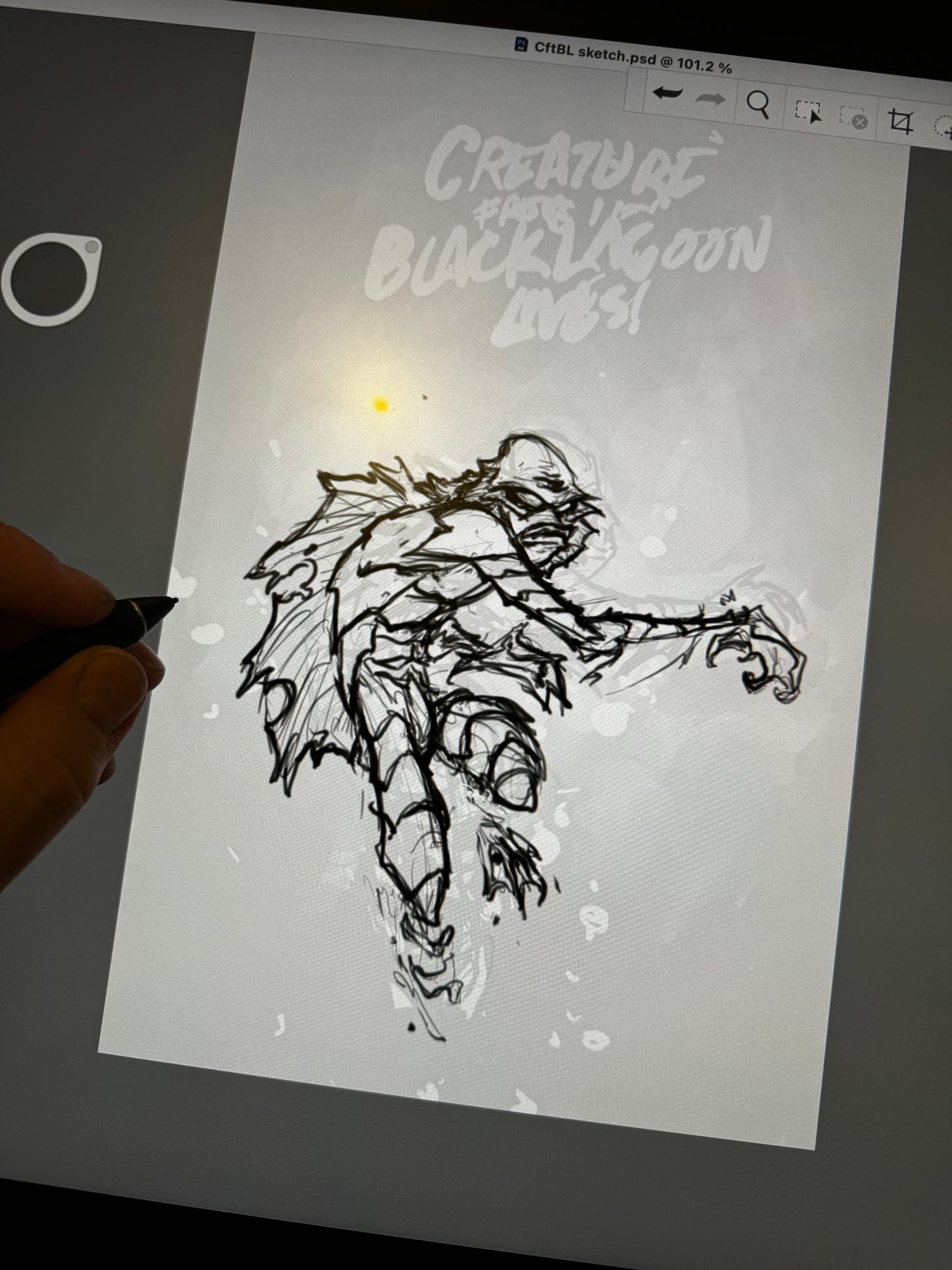
Every cover starts with a doodle. I wanted my The Creature From The Black Lagoon cover to be more about mood than humor or action. I wanted a sense of movement, but it to lean more creepy than kinetic. I remembered a commission I painted back in 2007 and thought it would be nice to revisit and tweak it a bit.
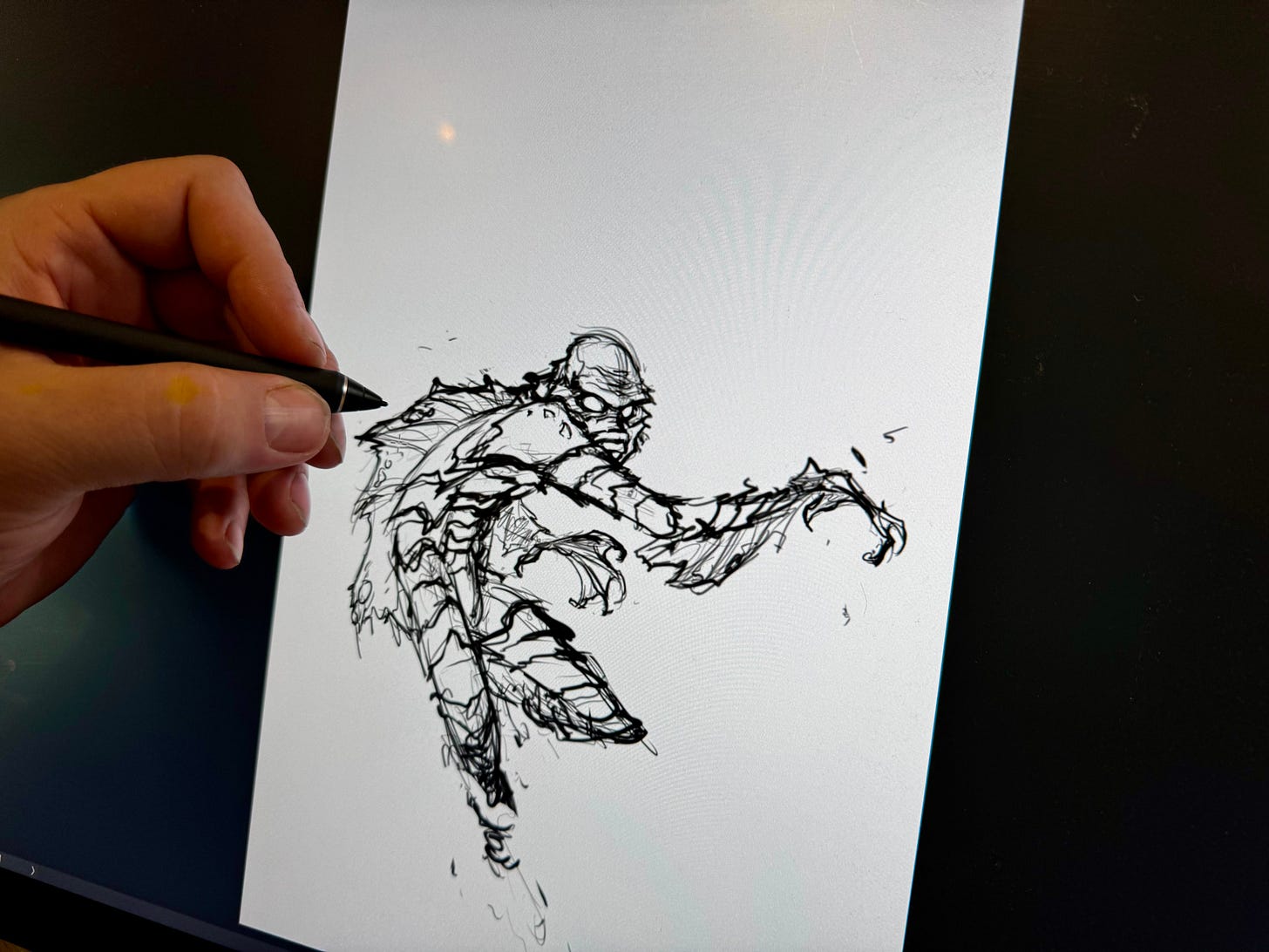
The 17 year old piece had a lot of elements I still liked, but Creature being above water wasn’t what I wanted to go for on this. I thought I could take that pose, add a bit more movement in and put him underwater to help add to the classic horror vibes. So I took my iPad with me to lunch and doodled this.
One of regulars sitting at the bar looked over as I finished this and said “Hey, fuck you, you talented asshole.” haha. He said it with a laugh and shared that it was crazy to him that I just did this while waiting on my food to come out.
PENCILS AND INKS
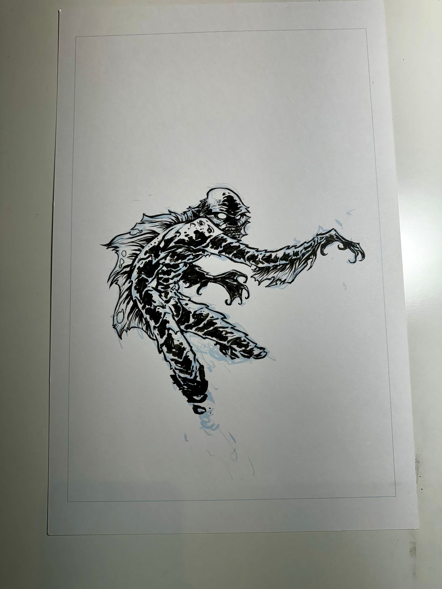
For the pencil stage I digitally refined in a bit and got it ready for inks. You can see I still kept it pretty loose. I like to do most of my decision making with my brush and ink.
Once I printed it out and inked it… I realized I wasn’t too thrilled with it. I mean, it’s was fine. It was an ok drawing. It checked all the boxes I wanted it to check. But something felt off.
I realized that it lacked some of the dynamics I usually put in a figure. The arms and legs are all the same width. More like tubes with scales on them. There was no variation throughout those parts and it felt stiff. Stiffness steals from the sense of motion I was hoping to achieve.
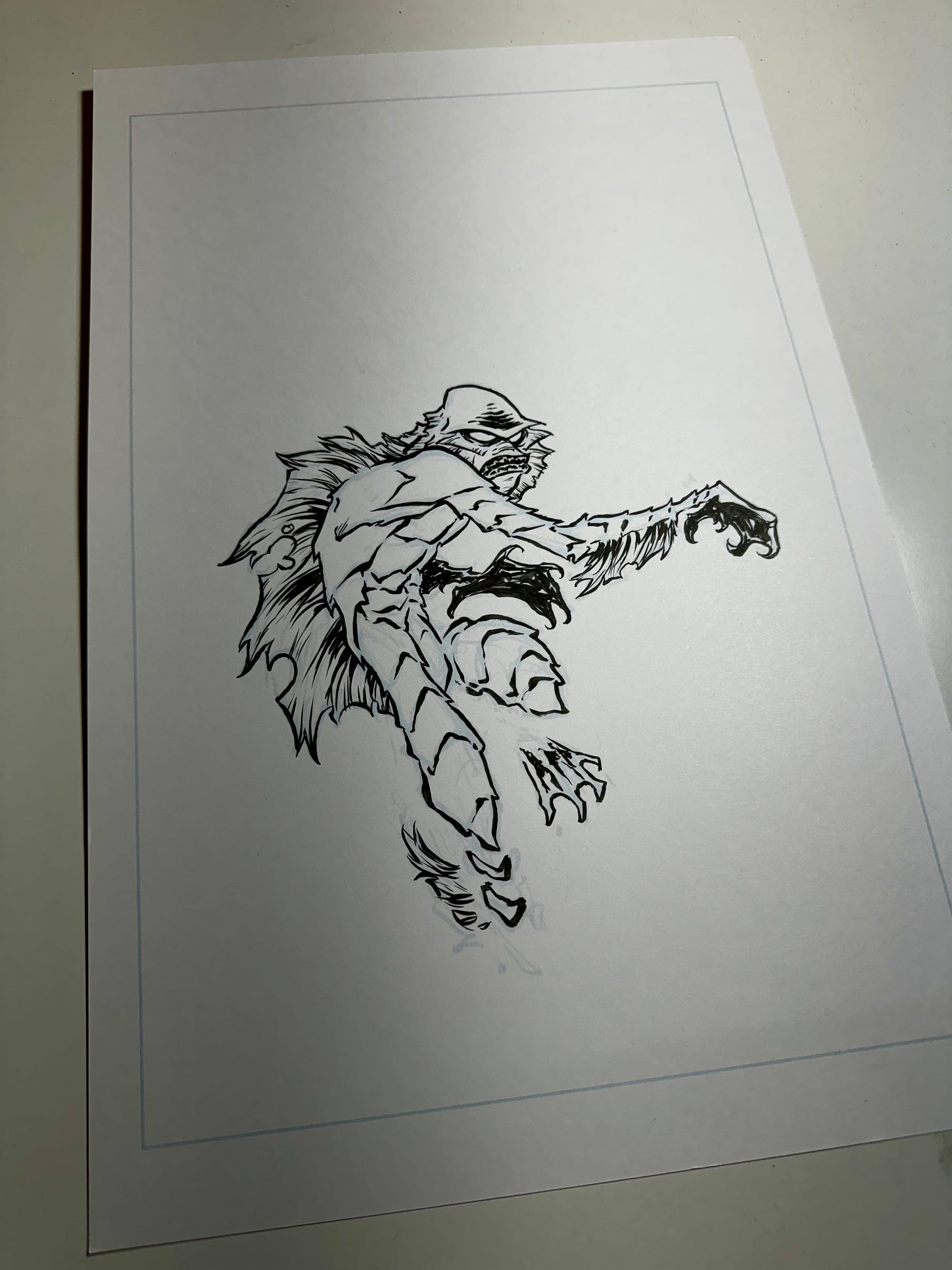
So I jumped back onto my computer and took another pass. And I was right. Just bulking up this part and thinning out that part added much more character and movement.
I printed this one out and inked it and was happy with it. I decided to add the spot blacks in digitally just so I could mess with a few options. And I had planned on doing some digital watercoloring for the watery background.
PIVOT…PIV-OOOOOT!
Yes that’s a quote from friends. Accept it and move on.
My original idea was to make Creature feel underwater with an ink wash like did on this old Boy At The End Piece. I thought I could pull it off digitally.
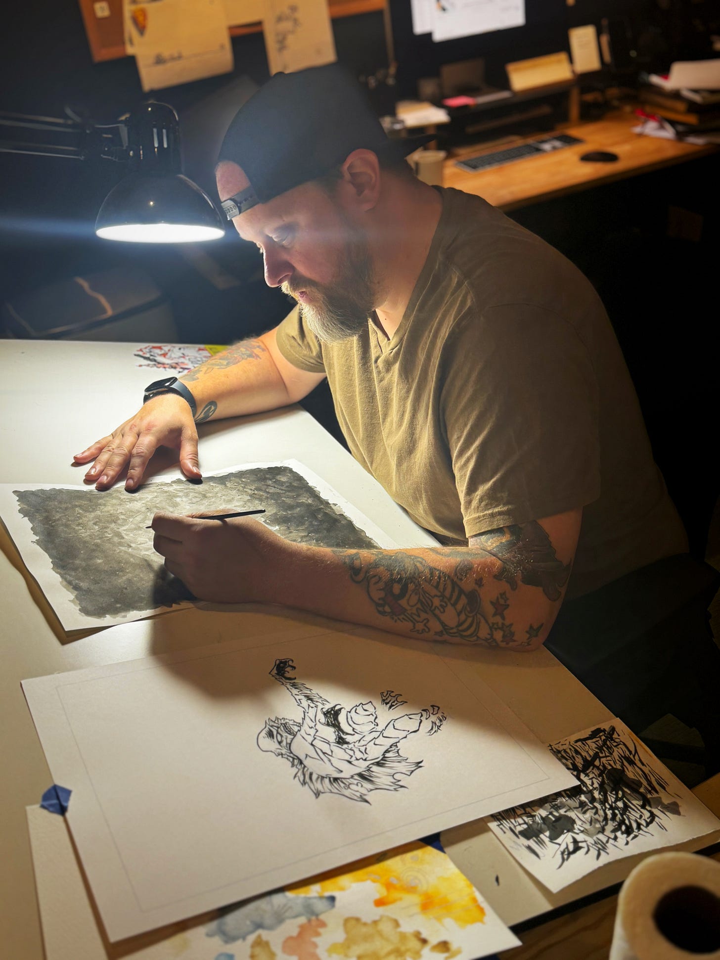
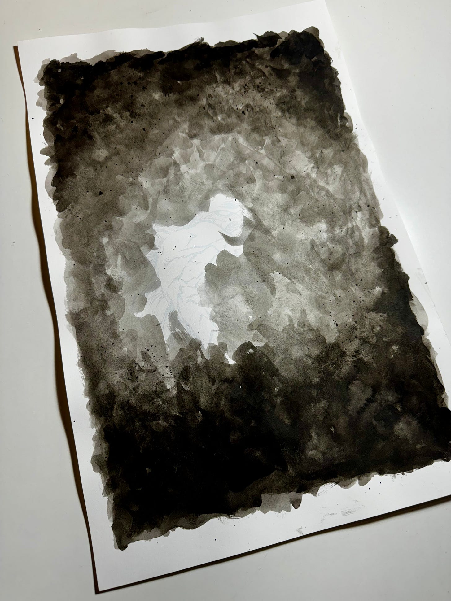
I tried a bunch of different brushes but nothing was matching what I saw in my head. I tried to go to my watercolor texture files to see if I could pull any rabbits out any hats and that wasn’t working either. I was starting to feel a little frustrated. I finally decided that if I wanted to get the feel of that Boy piece, then I should just do what I did for it. Use good-ol’ traditional brush, ink, and water.
I didn’t want to mess up the original inks so I printed the pencils out again and did an ink wash over it.
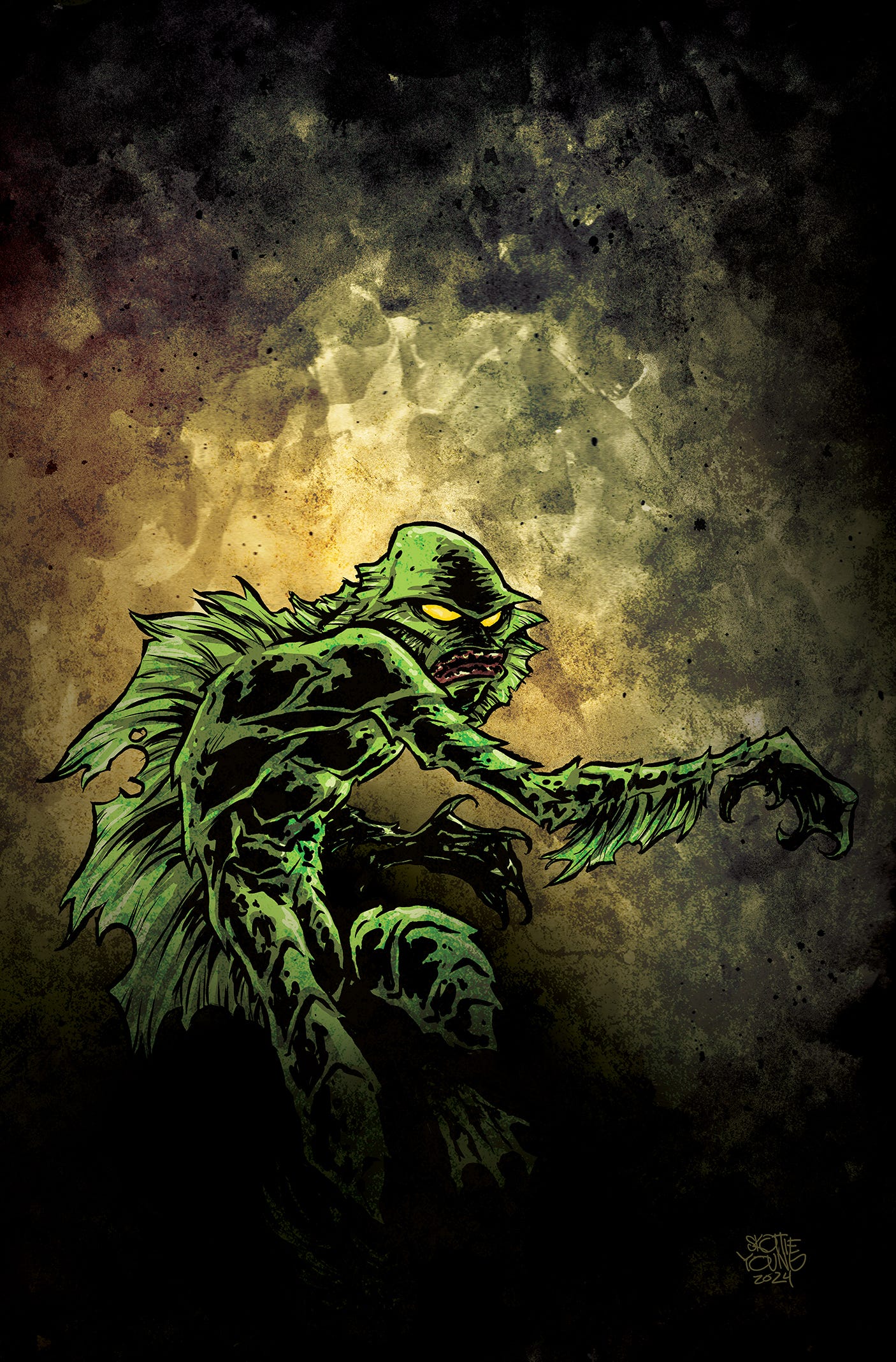
I scanned it in, put the two together in photoshop and threw some color around on it. This was the first version I sent in for approval. I was pretty happy with it. I liked the sickening tone of the yellows, green and orange together.
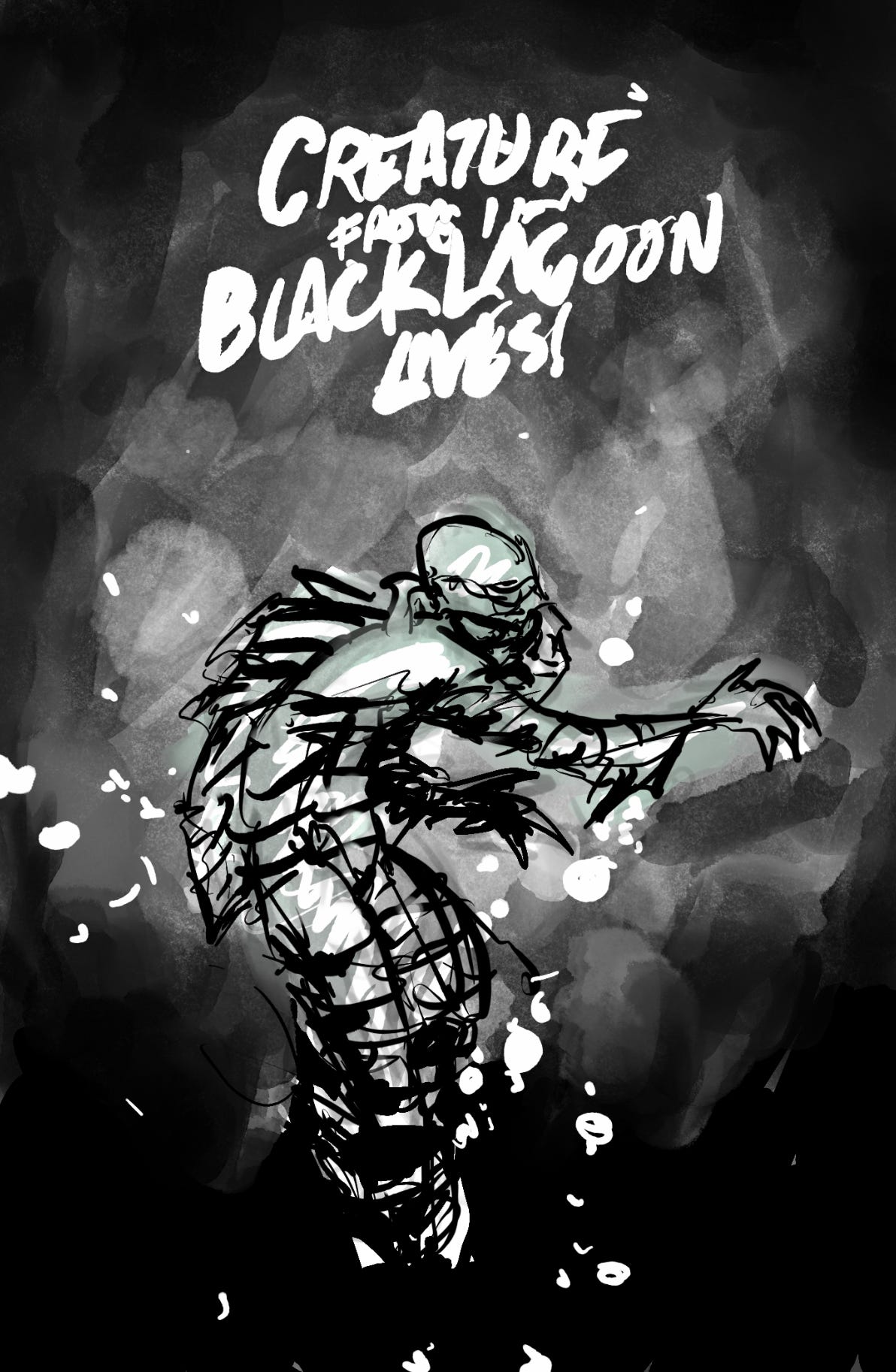
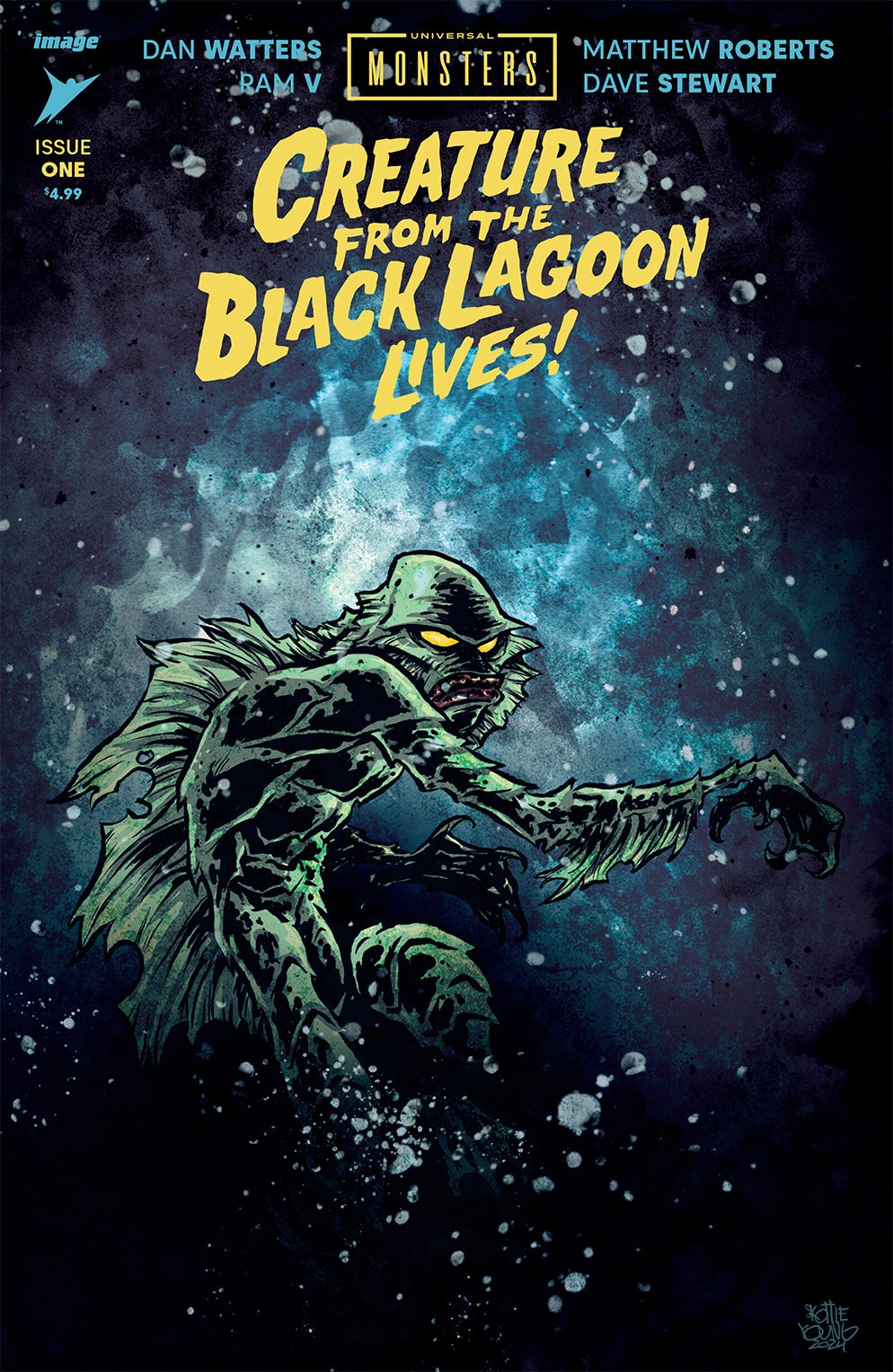
I don’t get notes on covers often, but this is a licensed property and they can be picky sometimes. They weren’t bad in this case. Their only note was to make it a bit cooler. Not cooler as in more RAD, but cooler as in temperature. That was fine because my first color pass was a cooler, blueish version and still had it saved.
The good thing about the note was, it gave me time to look at it a bit more and see that it was missing something. Creature wasn’t fulling feeling “inside” the water. It was lacking something in the foreground. I originally was going to draw and ink bubbles on there but it didn’t match the tone. So I found a cool splatter brush that actually ended up feeling like bubbles. Happy accidents!
ALL WRAPPED UP
And here is what I came up with for the final.
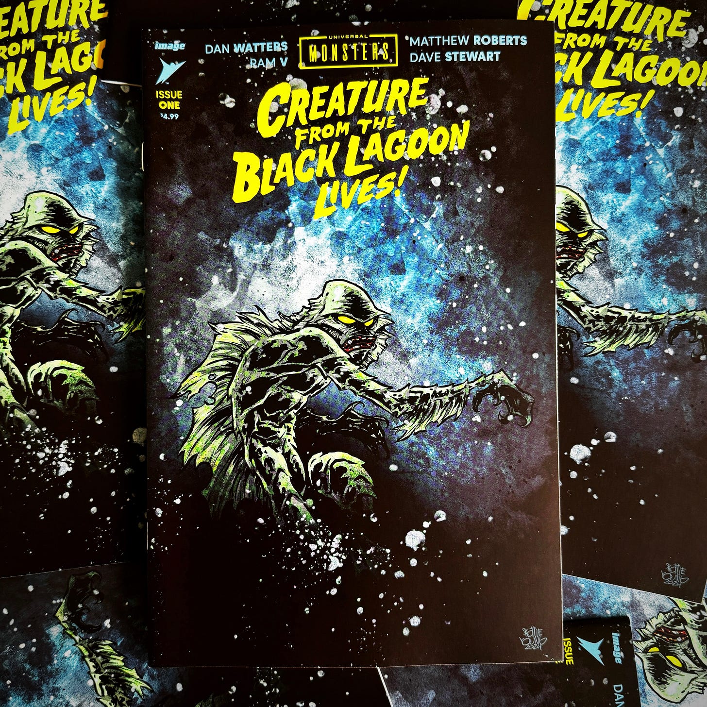
I hope you all an enjoyed a quick peek behind the scenes on the making of this Creature From The Black Lagoon Skottieyoung.com Exclusive Variant. Click below to get visit my store to get this and other cool stuff!





Thank you for sharing this behind the scenes. This is honestly my favorite cover you have given us. I love the Creature from the Black Lagoon. Hands down my favorite Universal Monster. Thank you once again for dropping a such a serious banger.
ABSOLUTELY enjoyed the background look at the process as always! Most people (including myself hah) tend to think you just knock the covers out in one go! Which I'm sure you do for the most part. But seeing how you go through the process of refinement and decisions is really nice. Especially working with this particular style, which I love and was so happy to see with this cover! Very cool to learn it was inspired from a previous piece you did with Creature from the Black Lagoon.
I also loved the fact that your attempt to do the watercolor background digitally ended with you just painting it physically. As an artist that loves digital technology, I find I trap myself a lot of times with trying to force the art in a certain way. When at the end of the day the only thing that matters is what works for the piece and not the tool utilized to create it.
So incredibly happy to have grabbed a slab copy of this and I'm kicking myself for not doing the same with Dracula! Here's hoping to seeing future Universal Monsters from you! Particular Wolf Man!